A new look
A new look
See the new design here.
People can be funny about brands. Graphic designers will regale you with speeches about consistency and taste. Lawyers will tell you more than you ever wanted to know about trademark law. People with “Brand” in their title will bestow upon you charlatanry about evocation, whimsy, and logos made entirely from circles.
I’ve found that when you dig into a lot of startup brands, they are not made from the expensive brand books and market research that you see at big companies. Instead, they are identities built from deeply held stakeholder values, company culture, and amalgamations of employee tastes. As you explore these brands you’ll find the leftovers of seat-of-the-pants decisions, organic growth… and mockups of logos made from circles.
I like to poke fun at companies and their brands, because while every designer plans for their work to become the next golden arches, the reality is that few brands amount to anything more than messy embodiments of the small companies they represent… and that is fine. When we stop taking our brands so seriously, they become fun, lively badges of honor for the people that champion them. From this perspective, it’s super important for new designers within a company to approach the existing brand with a healthy dose of respect, understanding that what they are working with is not a portfolio piece—it’s a backstory.
This is especially true for designers whose job is to evolve a brand. This is where I come into this story. As the first new design perspective at Sentry since @ckj, I’m doing my best not to mess up the good thing they’ve had going while preparing our brand and content for the next phase of the company.
We’ve rolled out a new look for our next chapter. Like the designers I poked fun at earlier, I have my own reasons for making my decisions, but in addition to trying to create a feeling in you the viewer, my goal is to carry forward a story that was written before me. What follows is my own personal charlatanry about the new Sentry style.
It begins with color
Sentry’s style starts with color. Color can be a really hard thing to work with for a lot of designers (I include myself in this group). As a result, a lot of tech brands fall into very safe, easy color schemes. As I updated our colors, I wanted to push both the brand and myself to avoid things that are comfortable.
For the base layer of design I chose a monochromatic scale of neutral purples, a color that a handful of employees mentioned wanting to see used more. I incorporated Sentry’s original red-orange in the form of a scale of fiery tones to grab attention and create contrast, and for the roll-your-eyes poetic reason that when future viewers focus on details within the site, it’s the original spirit-color of Sentry that brings them there.
These tones, when used in type and layout, behave with the same high contrast benefits black/grey/blue strategy that is ubiquitous in the tech industry. When used in illustrations, this vibrant mix of colors creates a volatile, dynamic visual impact.
It stands on illustrations
As I considered our future design direction, I intentionally choose options and techniques that take a little more time, a little more effort, or a little more skill. While it may sound like I’m drawing a line in the sand regarding quality of other identities, it’s really just the simple idea that when one has strengths, they should be used. Sentry can afford the time, I have the skill, so why wouldn’t we use those opportunities to try to stand out? It’s not better or worse, it’s what we have to work with.
Like safe color schemes, I feel that icons are used as a common design trick because free resources are prevalent and new icons are relatively easy to produce. Similarly, screenshots are easy to come by and tend to dominate marketing sites. However, the implementations of each commonly fail to fulfill their purpose—supplement written communication—by either under- or over-communicating.
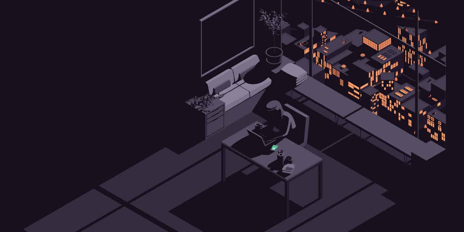
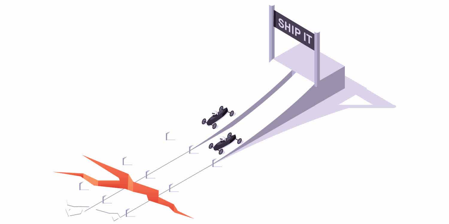
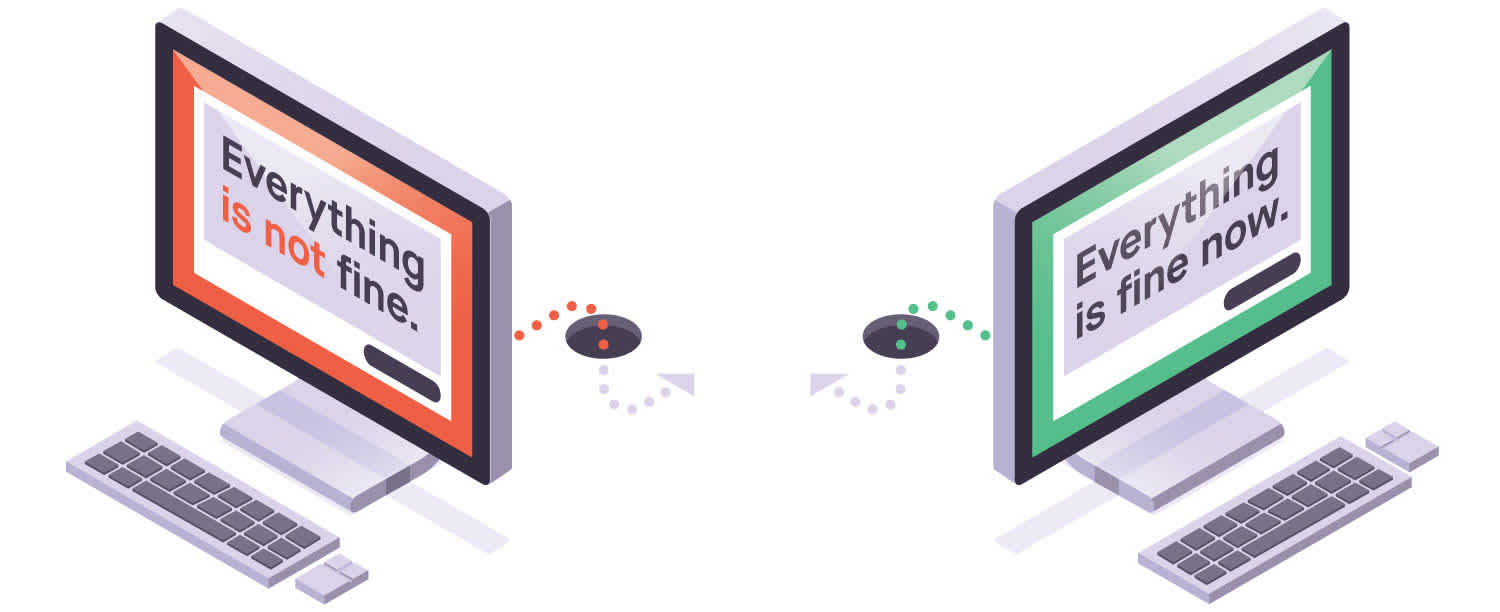
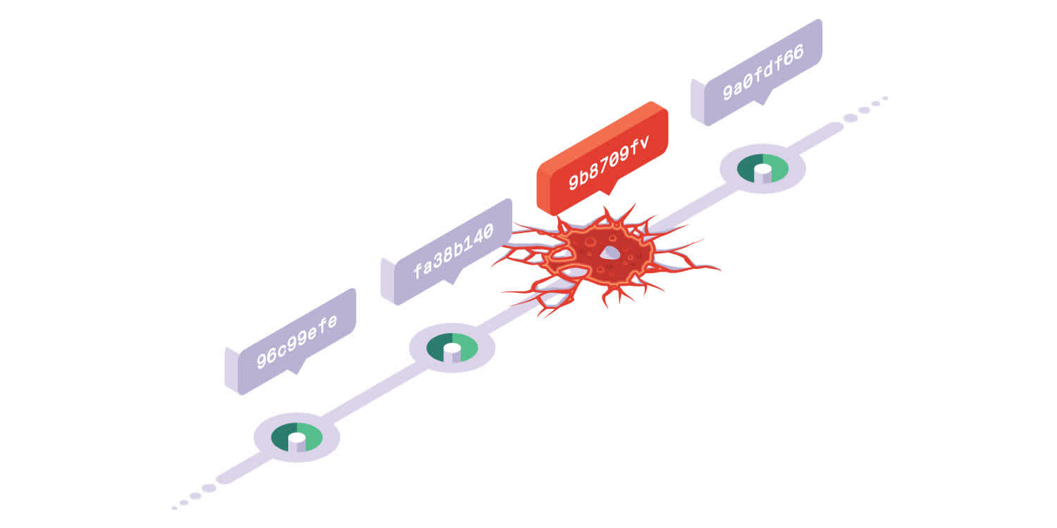
To combat this, I chose an illustration-focused style. Taking the razzle-dazzle interest role that icons tend to play, the illustrations create large visual anchors wherever they exist. As for communication, the illustrations narrow in on the one thing being communicated within their context better than a screenshot full of unrelated user interface details can. And honestly, while we may proclaim to one another that these images increase the communicability of the ideas they represent, in practice they’re really just nice to look at and fill up whitespace.
In practice, each illustration utilizes low detail and the neutral scale of purples for the base art, while focusing the fire tones and higher contrast where attention is desired. Text and fine detail, strong attractors for one's attention, are avoided unless they are necessary to communicate the core idea of each image.
Stylistically, each image is drawn in the isometric perspective as a very subtle reference to the origin of the company's name, a top-down realtime strategy game based roughly on an isometric grid.
It communicates with type
This is the section where I’m supposed to talk about x-heights, counters, and readability. Really, we thought the typeface, Maison Neue, looked nice and haven’t seen too many companies using it.
It communicates clearly
I often find myself frustrated with how commonly tech marketing uses adjectives, superlatives, and buzzwords as substitutes for clearly understandable communication of value. Every product and feature is described as "best in class," "the easiest way," or numerous other unmeasurable, intangible fluff words, incorrectly making the assumption that visitors to the site are already comprehensively educated about the topic they are investigating and are merely looking for the site that claims to be the best.
I’m fortunate to live in a neighborhood where every pizza place is the best in town. Jealous? It’s no surprise that this naive, trust-us-we’re-better business strategy is also ubiquitous on the internet. If websites were browsed alphabetically, I’m sure there would be far more AAA Big Data and ACME Web Scale Depo out there.
“Stop hoping your users will report bugs”
As Sentry’s marketing evolves in a micro-industry that is not yet considered standard practice, my goal is that we communicate what both Sentry and exception monitoring are through practical examples, rather than try to cloud readers’ minds with verbal MSG. Instead of hollow claims that we are the best, we’re starting this new push with a tagline that is designed to poke at a very real developer fear: that their software is broken for everyone except them.
It communicates with personality
As I read through Sentry’s original copywriting to get a sense of its spirit, a personality clearly stood out. It didn’t come across as an overly cordial, hand-holding tech support tool; a trendy, use-curse-words-for-lols developer tool; or a monotone, buzzword-robot enterprise software company.
“Have some self-respect while you monitor exceptions”
Sentry’s voice is that of your best friend: it’s articulate, it’s honest, and it doesn’t take itself too seriously. In writing the copy for the new site, I tried to retain this spirit, clearly articulating what needs to be communicated, making a subtle joke here and there, and using asterisks when curse words are used for lols (we’re not animals).
It tries to tell a story
Every brand designer will tell you that what they’ve created is a unique, pioneering artifact which has never been seen before. I’ve never read a post of this type that is realistic about itself, and perhaps this is where I can help our brand be unique. Purple and orange have been combined before. The typeface and isometric perspective have been used before. Tongue in cheek taglines have been written before.
When you talk to people who love the brand that represents them, it’s not its uniqueness that is important to them. What they value is the expression of who they are, where they’ve been, and where they’re headed. And circles. Everyone loves when the logo is made from circles.


