Building Dark Mode
Building Dark Mode
Like many companies, we have a Hack Week at Sentry. In 2017, we coded an app which blared entrance music for anyone who stepped foot in our office. In 2019, we encouraged folks to be nice on the Internet. Noble causes, sure, but for this year's Hack Week I was determined to advance a cause near and dear to my cold British heart: dark mode.
Little did I know that what started as a minor hack week project would become a major lift that included pantone colors, hex codes and all sorts of variables.
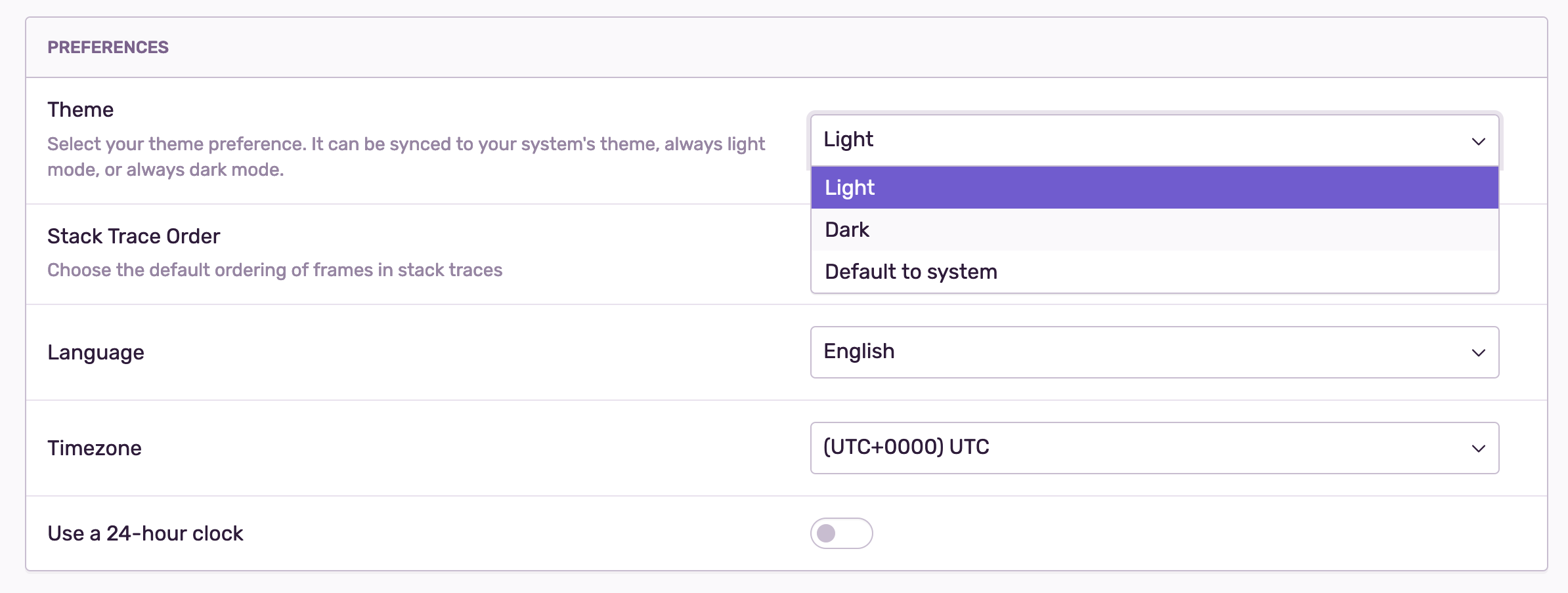
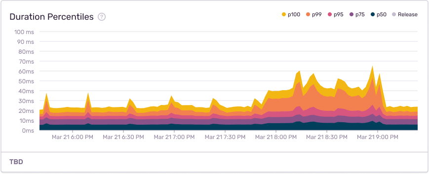
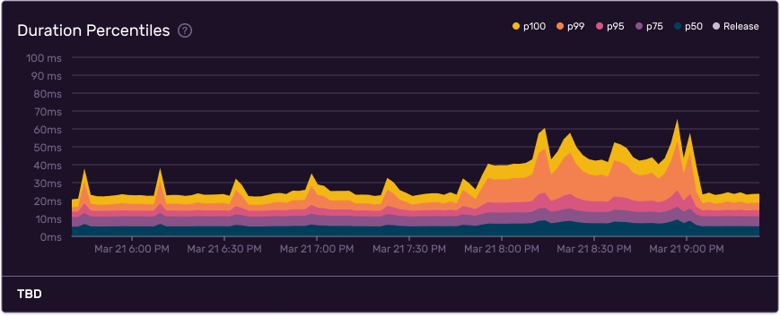
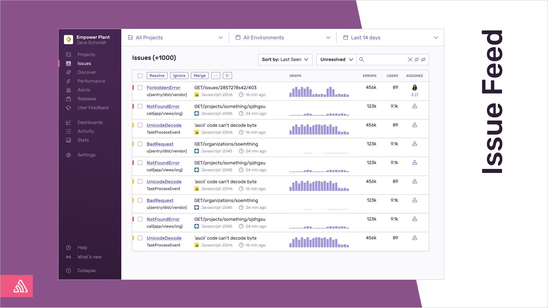
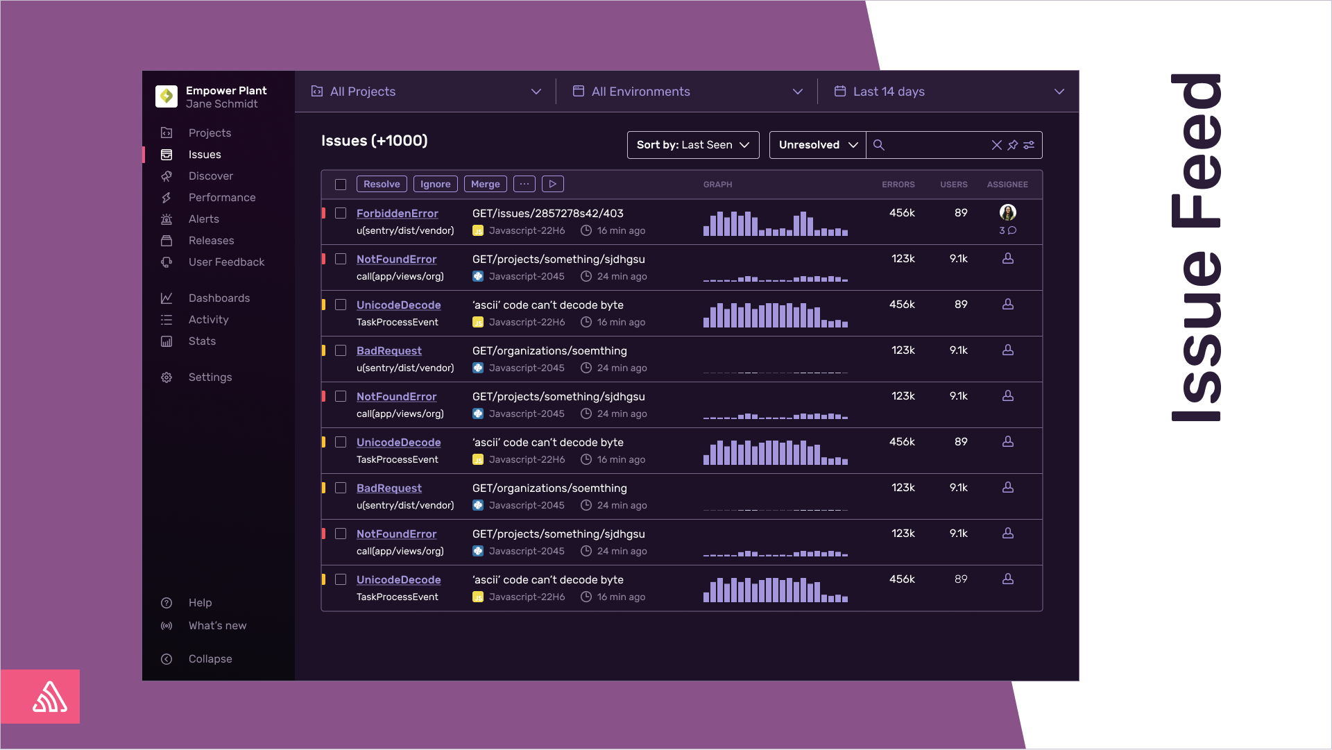
But first things first. If you head on over to User Settings > Theme you can toggle Dark Mode on. We also added an option where you can switch it based on your default system theme:
Given its recent popularity, you might believe dark mode is a fad. But from a design perspective, dark mode is exceptionally useful. That's because a big part of design is about building relationships between colors. And so implementing dark mode essentially forced everyone on the team to think long, hard, and consistently about our front-end design components. In short, dark mode helped our design system not only look good, but make sense.
We organized the work into three buckets:
Cleaning up variables
Designing the system
Creating aliases and refactoring components
Cleaning Up Variables
As I began spelunking around our codebase, I found all sorts of color inconsistencies. Things like scattered hex codes and one-off variables such as blueLightest or offWhite being used in all sorts of curious ways. This meant that whenever an engineer wanted to actually to build something, they were forced to think way too long and much too hard about which color they should use.
Here's an example: I want to add a border to a component. Okay, cool. Which variables can I use? Lemme see. I like gray, so let's use gray. Simple enough, right? Well, there are eighteen grays — not to mention its border variables and hex codes. Which one should I use? Why is the design I'm looking at using a new border color? Where in my life did everything go wrong?
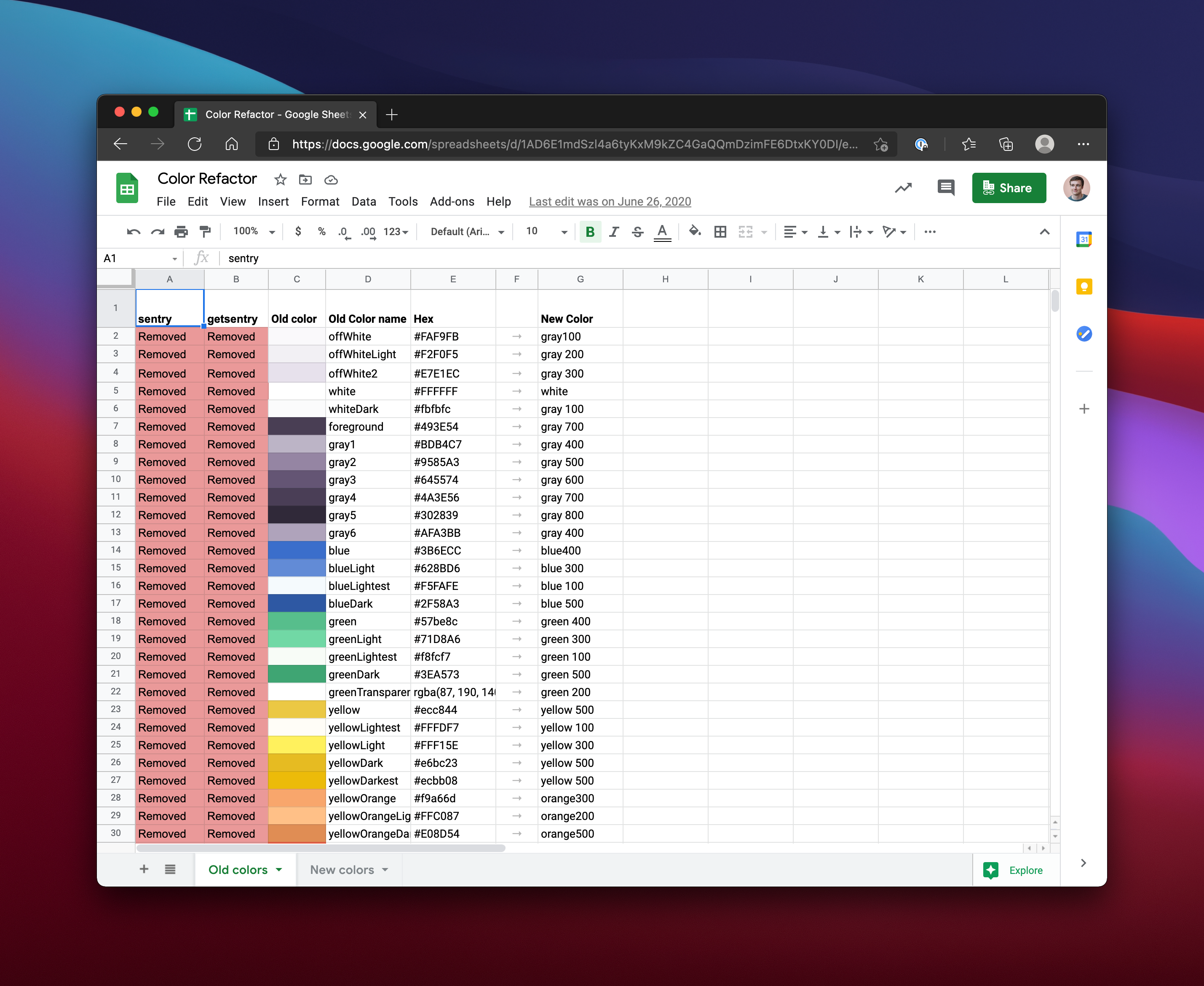
No engineer should be forced to answer these questions, and so we went about cleaning up all this junk. To kick things off I made a map of every variable that uses React components. This map was nothing more than a spreadsheet (gross), but it did serve an important purpose: I now knew which deprecated color variables should be replaced. This spreadsheet would help us make a lot of small pull requests where we could change yellowLightest into a new variable called yellow400. Also, by making lots of small pull requests for each variable, we could also limit regressions.
Thankfully, most of these variables were stored in one place, as we had been pretty strict about storing them in the theme.tsx file we imported into our React components. Within those components, we applied those styles to emotion, our css plugin. That sounds like a lot — and it is — but emotion is well worth the overhead when building complex apps, as it allows us to isolate our CSS all in a single component like Dropdown so we don't have to worry about those styles bleeding into other files or pages.
Here's an example of a component that uses emotion:
import React from 'react';
import styled from '@emotion/styled';
const ComponentName = styled('div')`
color: ${p => p.theme.offWhite2};
`;
export default ComponentName;To remove a color like offwhite2, I needed to search across both our codebases and find all the React components that used that particular variable. Only then could I replace it with something more sensible. Within our theme.tsx file we then organized them into something like this:
const colors = {
  white: '#FFFFFF',
  black: '#1D1127',

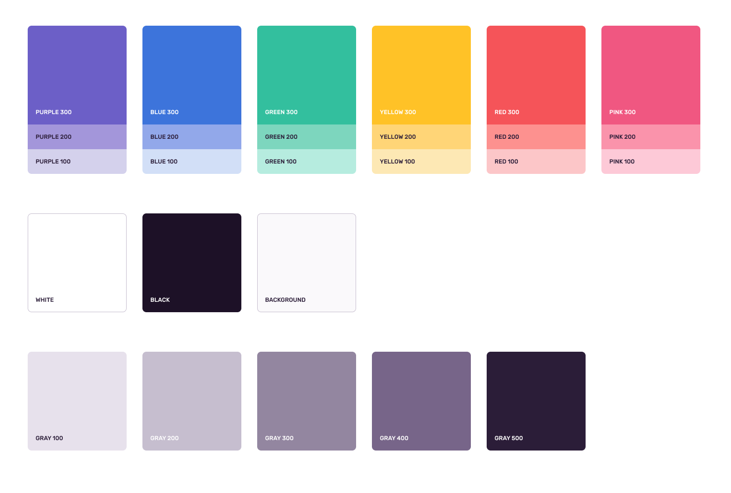
  gray100: '#E7E1EC',
  gray200: '#C6BECF',
  gray300: '#9386A0',
  gray400: '#776589',
  gray500: '#2B1D38',

  yellow100: '#FDE8b4',
  yellow200: '#FFD577',
  yellow300: '#FFC227',

  purple100: '#D4D1EC',
  purple200: '#A396DA',
  purple300: '#6C5FC7',

  blue100: '#D2DFF7',
  blue200: '#92A8EA',
  blue300: '#3D74DB',

  orange100: '#FFF1ED',
  orange200: '#F9C7B9',
  orange300: '#F69C7D',
  orange400: '#FF7738',
  orange500: '#BA4A23',

  red100: '#FCC6C8',
  red200: '#FD918F',
  red300: '#F55459',

  green100: '#B6ECDF',
  green200: '#7DD6BE',
  green300: '#33BF9E',

  pink100: '#FDC9D7',
  pink200: '#FA93AB',
  pink300: '#F05781',
} as const;
In total, this process took weeks of part-time refactoring work, but once it was done it was quite satisfying. We finally had a list of colors that were mostly consistent, to the point that whenever an engineer came to build something they'd know to use these variables. And now that there were fewer options in our system, we could start thinking about the relationships between all these colors.
Designing the Color System
We still had some daunting questions to answer. How are we using color in our app today? What are the default active, hover, and focus states? What are the common border colors? What should our text colors be? And finally, how are those states represented across dropdowns, form fields, buttons, toggles, links, and tags?
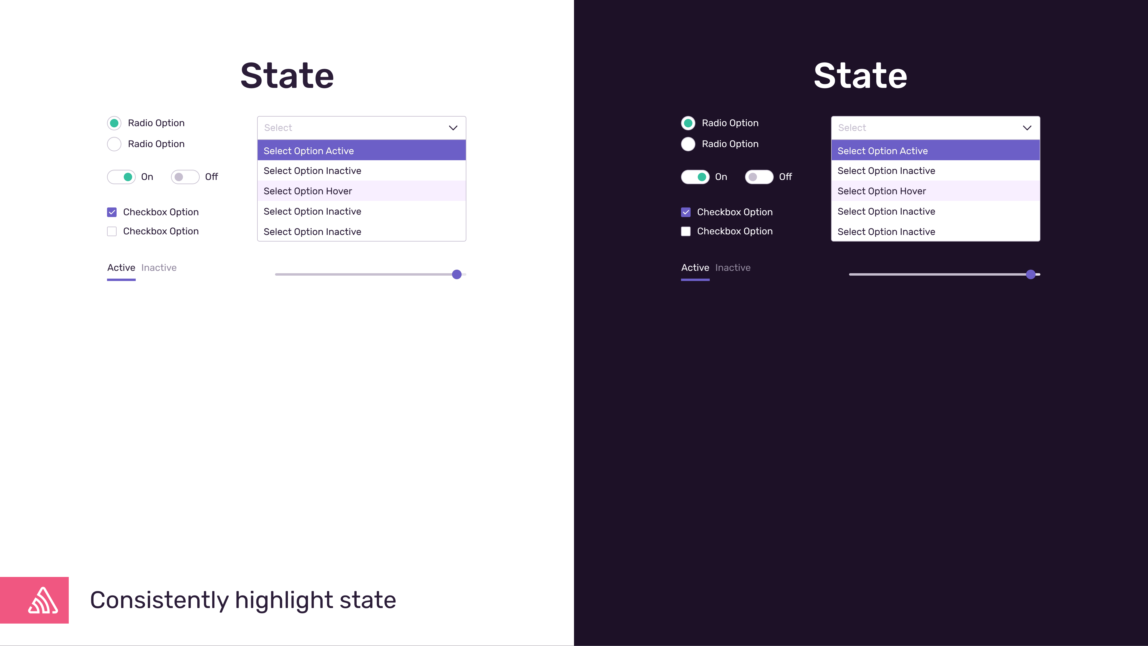
To tackle these questions, we needed mockups. After gathering our most common components together in Figma, we found a bunch of inconsistencies in our text and form styles, as well as how we applied border colors to all of our components. And so by unifying all these visual inconsistencies (by creating a smaller list of variables) we could make our UI work for both light and dark mode at the same time.
Here’s an early mockup of those updated components:
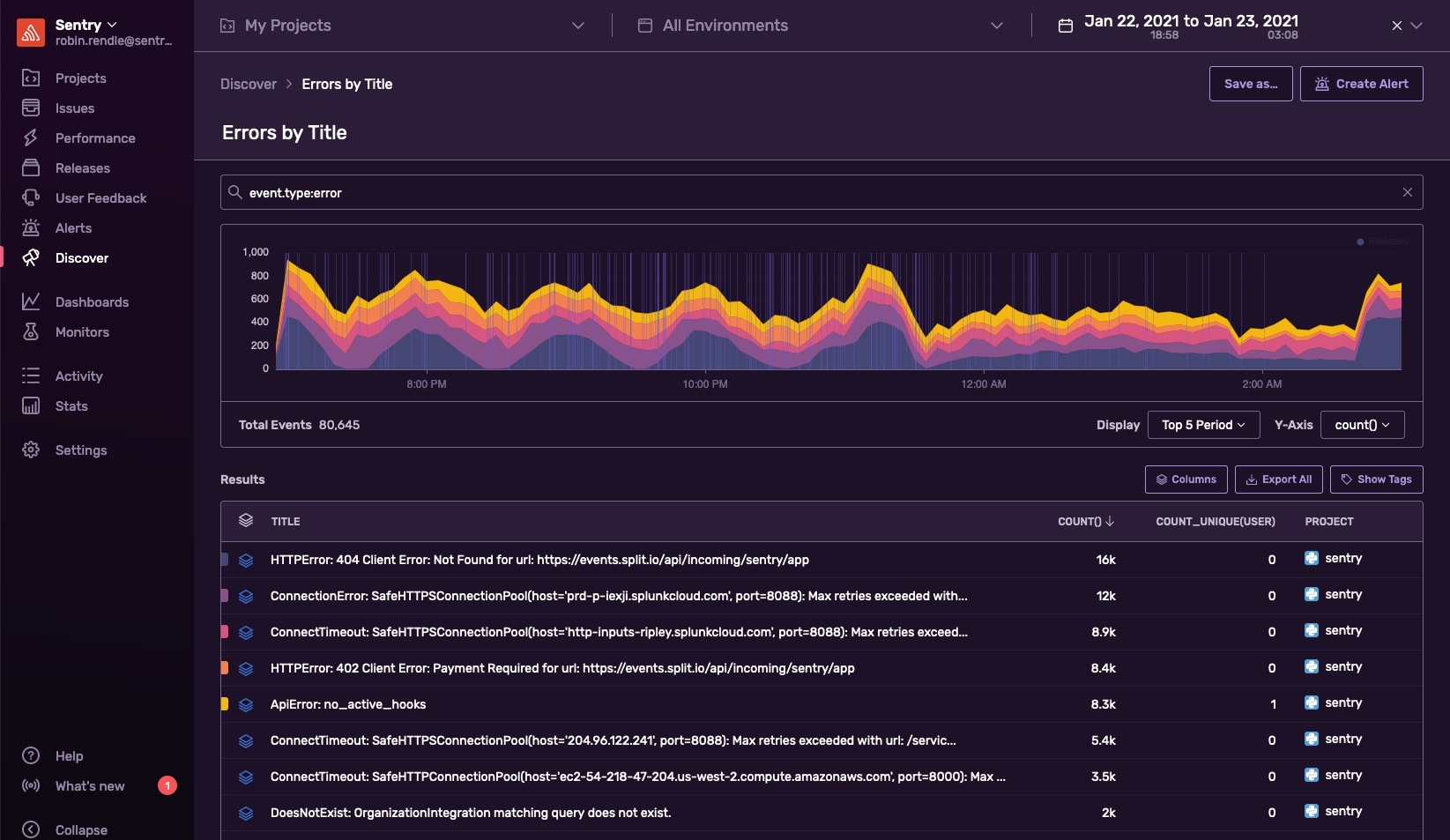
This work involved looking across multiple Sentry features — Issues, Discover, Releases, Performance, Alerts — to make sure that the color system that worked for our charts also worked across dark mode.
Next, we created a separate dark mode color palette for our charts:
Once we felt the base styles had good coverage, we began structuring the UI together in Figma. This not only let us think about how some of these changes might affect customers, but how we could improve accessibility across the board for all our components:
After moving back and forth between our smaller components and our layouts, we finally nailed down our new color palette. Again, remember the idea here isn't just to support dark mode, but to resolve all the outstanding questions surrounding how to build new components. Folks shouldn't have to Slack the design team to figure out which gray to use for gray text.
A fact of life for designers is being annoyed by your own solutions. For example, I was a little irked that we have a separate background variable here, instead of just adding a new gray. But it makes sense for our product — and how we want to use our color system. When my system clashes with a real-world problem, my system needs to bend to the problem — not the other way around. Consistency is more important than ideological purity.
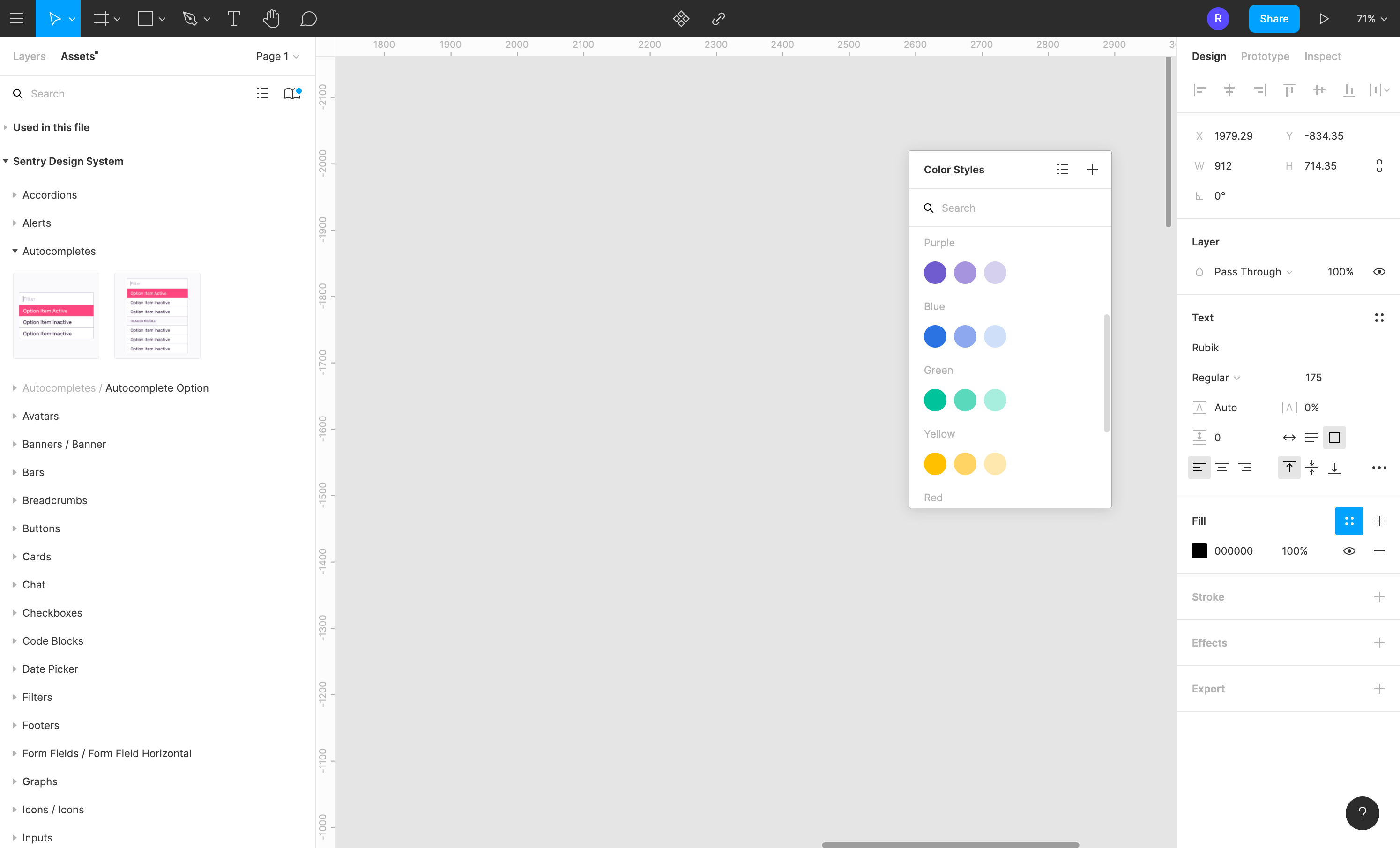
It was at this point that we added our design system's variables to Figma, so that any new colors we used in the future would use these updated versions, too:
Now all we had to do is build the dang thing.
Creating Aliases and Refactoring Components
We knew we wanted our paragraph text to be gray500 in light mode but then switch to white in dark mode. This toggling between light and dark modes would require an alias such as textColor to flip between these two options. To do this, we needed to create a whole bunch of aliases within our theme.tsx file.
In this file, we first define our range of colors and then we create those aliases like textColor, subText, and borderColor. But this was not an easy process: we argued a lot about the naming conventions and their use across our components. It wasn't until we started refactoring our components that these names began to make a bit more sense.
const colors = {
  white: '#FFFFFF',
  black: '#1D1127',
  gray100: '#E7E1EC',
  gray200: '#C6BECF',
  gray300: '#9386A0',
  gray400: '#776589',
  gray500: '#2B1D38',
  // other vars go here
} as const;

const aliases = {
  /**
   * Primary text color
   */
  textColor: colors.gray500,

  /**
   * Text that should not have as much emphasis
   */
  subText: colors.gray400,

  /**
   * More...
   */
}
The aliases above are the colors for our light mode. Next, we started to create the dark mode aliases in this file while refactoring our components and adding new aliases as we found them. In this same file, we have a new object that contains all our colors for dark mode:
const darkAliases = {
  ...aliases,
  bodyBackground: colors.black,
  headerBackground: colors.gray500,
  background: colors.black,
  backgroundSecondary: colors.gray500,
  border: colors.gray400,
  innerBorder: colors.gray500,
  textColor: colors.white,
  // more aliases go here
} as const;
This involved multiple conversations about how our components look across different features — what might work for one component in one place, might not work for another component somewhere else.
We started by refactoring each of our components to work with these new aliases. Here, we identified common patterns where we would have to replace every instance of a variable with these new aliases. One example is text color: sometimes this was as easy as switching out all the gray400s in our components, and sometimes it would involve checking each component to find where we were setting gray500 on the color CSS property. This meant many trials — and errors.
However, one of the hardest parts about this refactoring project is that all our styles weren't located in one place. While our variables and aliases were (somewhat) neatly stored in our theme.tsx file, our styles were still spread out across the following mini-systems of CSS:
Bootstrap styles: We're still breaking up these styles into individual
.lessfiles and then refactoring those into our React components. There's a ton of unused styles here that need to go and we don't style anything with ourtheme.tsxvariables here.Base styles: This is a
base.lessfile that's a reset and a normalize.lessfile that we made after refactoring a ton of stuff from Bootstrap. These are the core styles for default HTML elements, so we also can't use our fancy variables fromtheme.tsxhere either.Global styles: This is a
.tsxfile that's overriding a bunch of stuff from Bootstrap and Base styles and does use styles from our theme. Ideally, everything from Base should be refactored into our Global styles, but that's not possible since some of our pages aren't in React yet.Components: As I mentioned, each of our components use emotion (which I both love and am somewhat annoyed by) which override our Global styles, which themselves override our Base styles. Phew.
Styled components: These are one-off variants or modifications to our components used in a feature like Issues or Alerts. This is where emotion falls somewhat short for me (and we would like to extend it perhaps with something like Tachyons instead). While some of these modifications are due to the fact that our components need tidying up, others are necessary because our defaults in Base and Bootstrap need deleting entirely. Double Phew.
If you think all of this sounds and looks like an utter nightmare, well, I won't argue with you. And yet I think that's sort of the value inherent within building dark mode: you can now see all the relationships between your components and your styles and your design system.
I've worked on a few refactoring projects like this in the past and I know how easy it is to see every problem as the Most Important Problem Of All Time. But that's almost never the case: in every codebase there's always stuff that needs refactoring. And so you need to be careful about what you refactor and why.
I subscribe to the belief that there's three types of code. There's Boring code: the good part of your codebase that doesn't need refactoring. If you're building a large-scale web app, it's unlikely you have much code like this. Next, there's Salt Mine code. This is the stuff that's poorly written but doesn't need to be refactored because it isn't doing active harm. It's gross, but it's fine. And then finally there's Radioactive code. Not only is it poorly written, it's doing active harm by leaking into other parts of your codebase and continuously creating toxic problems:
Radioactive code is the real problem at the heart of every engineering team. It’s the let’s-not-go-to-work-today sort of code. It’s the stuff that's worse than bad — it's actively poisoning our codebase. Imagine a codebase as a nuclear reactor; radioactive code is the stuff that’s breached the container and is now leaking into every part of our codebase.
For most front-end codebases, the design of your color system shows you where your radioactive styles are. It shows you how things are tied together, and what depends on what. Sure, we wanted dark mode to look great. But we also wanted to make sure that dark mode doesn't slow us down by introducing even more problems than we already have.
And I think that's what our team achieved here. We made our designs more consistent, buried those radioactive styles, made relationships between colors, and hopefully slightly improved the way we build front-end components moving forward.
It's certainly the long, hard, and stressful way of doing things, but more important, it's the way that worked for us.
If you've read this far, you're either a bot — or passionate about design. Turns out we're hiring. Come join us!

