Measure, Track, Improve: Streamlined event exploration and increased visibility into team health
Measure, Track, Improve: Streamlined event exploration and increased visibility into team health
For many engineering leaders, measuring their team’s impact can be hard to quantify and a face:palm process, filled with searching through logs and exporting data sets to cobble together a report that most people won't even look at twice. And let's be honest, if you wanted to spend time making reports, you wouldn't have become a developer.
That's why we made updates to Dashboards, Discover, and Stats for a simpler way to explore your raw event data so you can see how events are impacting users, learn how your team is taking action on those issues to improve overall application health, and then share those view across your team–even with someone who doesn't use Sentry today.
Get answers faster with improved Dashboard and Discover compatibility
Dashboards and Discover go hand in hand. Discover is our query engine that helps you answer anything about changes in your code. Dashboards help visualize those answers and much more.
Sure, you can quickly answer questions in Discover like, “did signups drop in Europe?” or “which pages have the most errors?” and save that query. But these are questions that your leads may also want to track consistently in a single view.
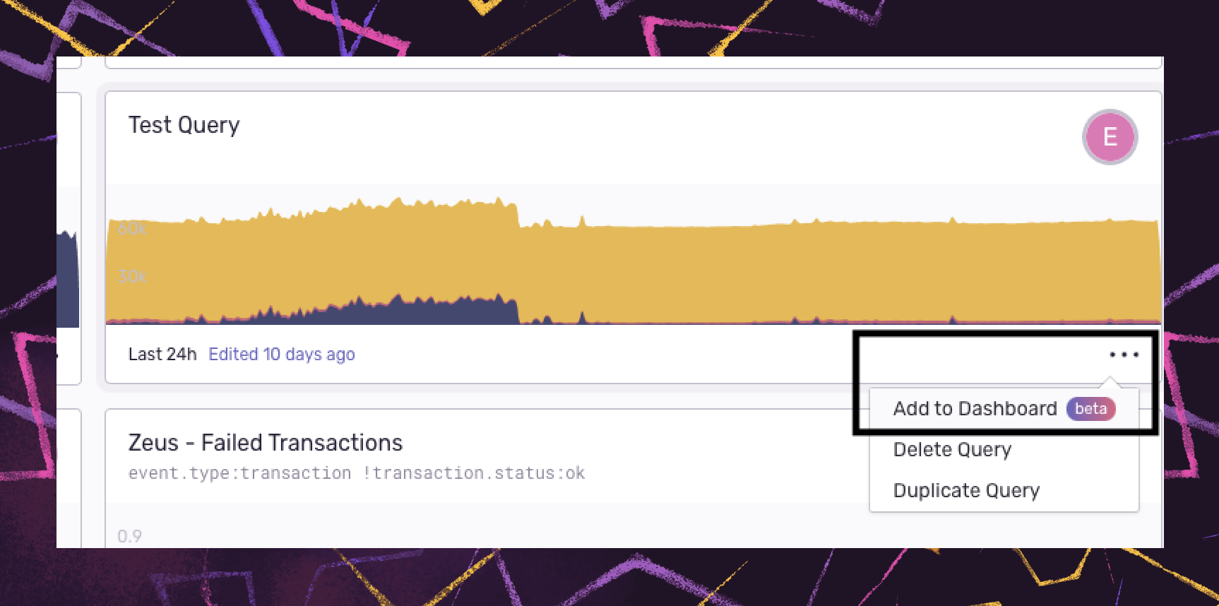
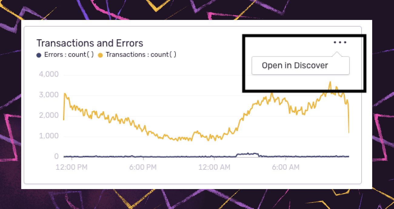
We’ve connected Discover and Dashboards so you can add any Discover query as a widget to your custom dashboards (and vice versa), making it easier to uncover trends and anomalies and use that information to prioritize and track the investments you are making in your team and product.
Because this functionality works both ways, if you have additional questions after looking at a widget in your dashboard, you can drill deeper into your underlying event data and investigate it within Discover.
Dashboards have accelerated our time to resolution significantly. The first time I opened up our performance Dashboard, I identified two data points that helped me solve an arcane issue we had been troubleshooting within 1 minute.
Ryan Beal, Engineer at CBS
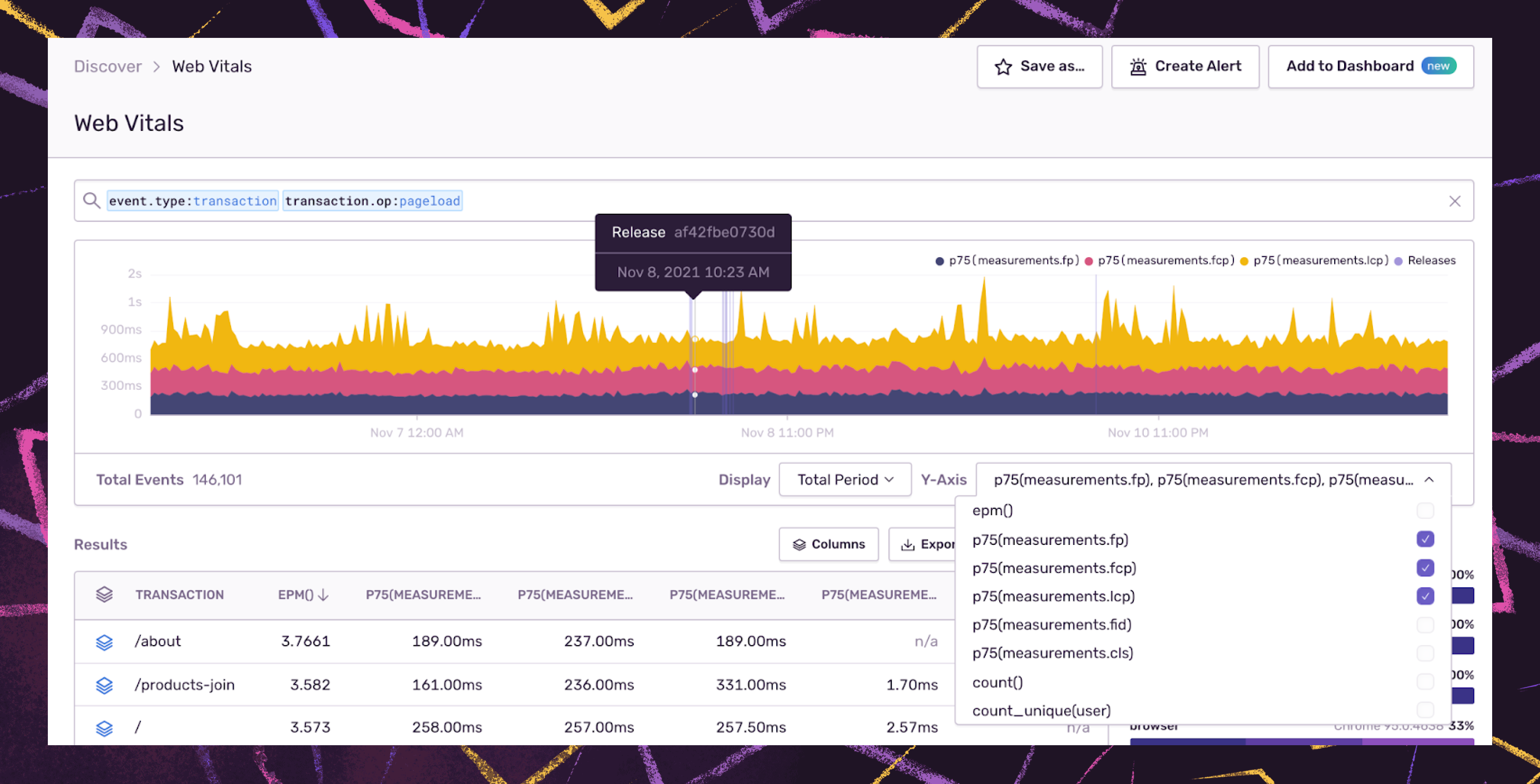
Additionally, you can display and plot up to three different Y-axis series for easy comparison in Discover. For example, you can monitor how a new release impacts frontend performance by adding release tags alongside your core Web Vitals - Largest Contentful Paint, First Input Delay, and Cumulative Layoutshift - to view layout shifts or latency spikes that impact the user experience.
With Sentry Performance and Discover, you can look at each event and determine the exact operations causing your Web Vitals to lag and whether that extra call is worth doing before the LCP.
See the issues and charts you care about most
In addition to connecting Discover and Dashboards, we made some common sense UX improvements to our query displays and dashboard and chart sorting options so you can filter the top issues, queries, and dashboards relevant to your team.
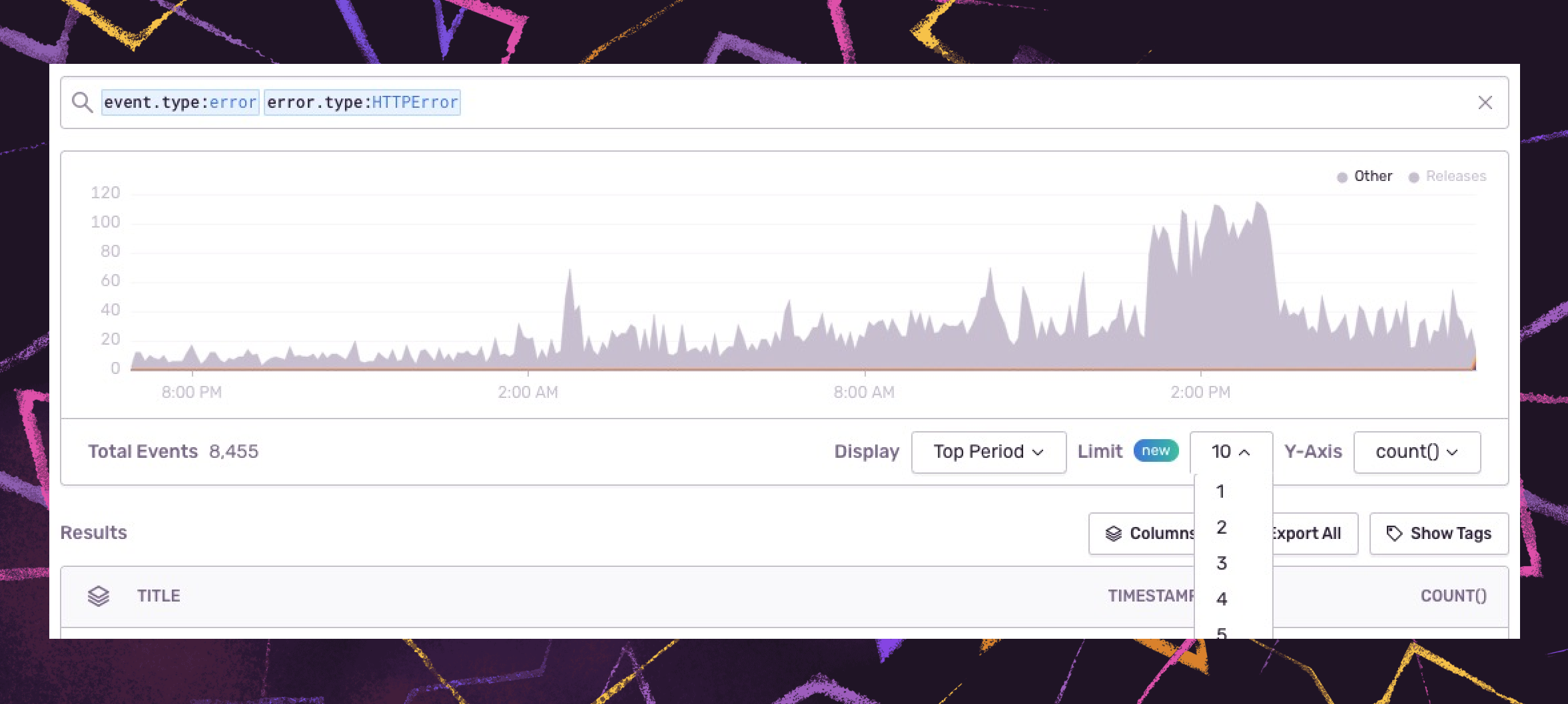
You can filter your chart down to the top 10 results according to fields like projects, transactions, issues, or even browsers within a given period by adding a stacking function to your query. By visualizing the top errors, for example, and how they compare to the rest of the results, you can quickly identify critical issues and anomalies across the organization and ensure the right team or individual takes action accordingly.
The 'top exceptions by volume' chart has been critical in our bi-weekly departmental meetings to raise awareness and urgency to issues across the engineering org. Some of these can highlight problems with our codebase or reflect service outages where we can learn how those services impacted our code and then analyze how to lessen the impact of those outages in the future, which has saved us potentially millions.
Wade Winningham, Principal Engineer at Power Home Remodeling
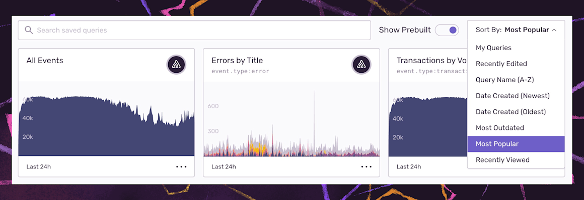
Plus, for large teams and those who live in Discover, we’ve added additional sorting options–‘Recently Viewed’ or by ‘Most Popular'–so you can filter on the queries or dashboards that are most relevant to you or your organization.
Drive cross-team collaboration with Discover charts in Slack
Whether it's the most critical issues, the users most impacted by slow API calls, or if a release is trending poorly (or well), we want you to get the answers to your (or your boss’) questions quickly, without having to leave the conversation.
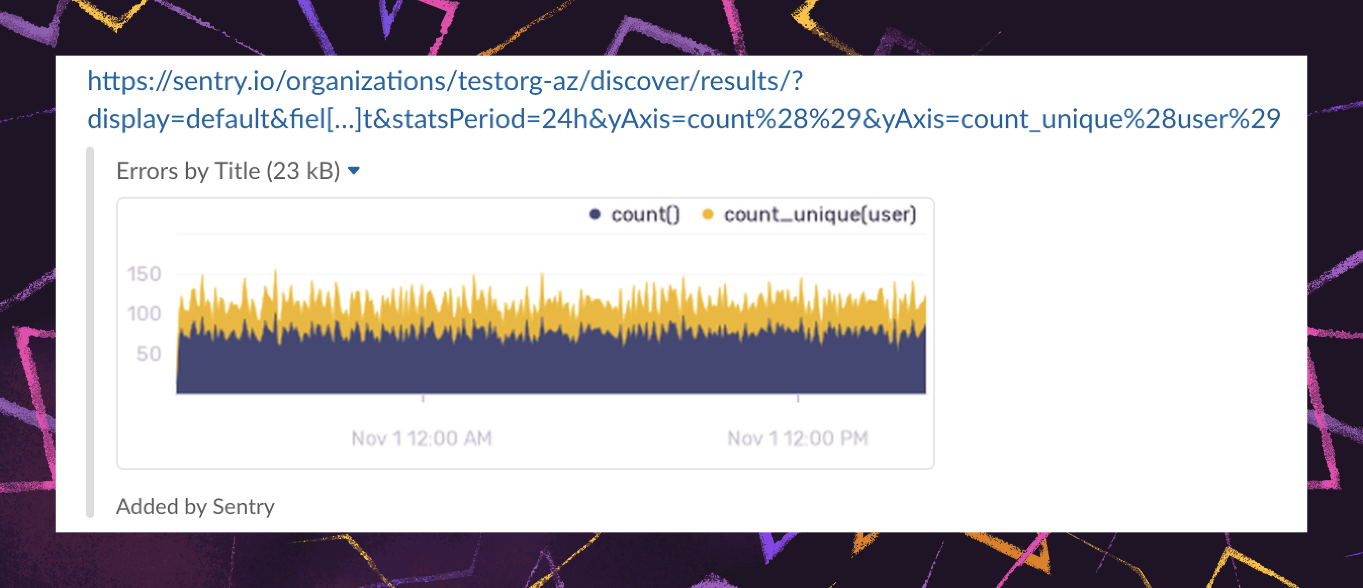
That’s why while we were busy making all the improvements outlined above, we also made it so Discover queries will unfurl in Slack. With chart unfurls, your team members can see and comment on charts directly in Slack without logging in to Sentry, adding context and continuity to your conversations. (From our dev team: Look, this was technically scope creep. So don’t tell our PM that we’ve been sandbagging story points, or we won’t be able to ship more little improvements like this.)
So the next time your manager, who can’t log in to Sentry because they let their invite expire, asks you to send them the top ten performance issues, Slack them the query and remind them to configure SSO.
Monitor team velocity and efficiency in Stats
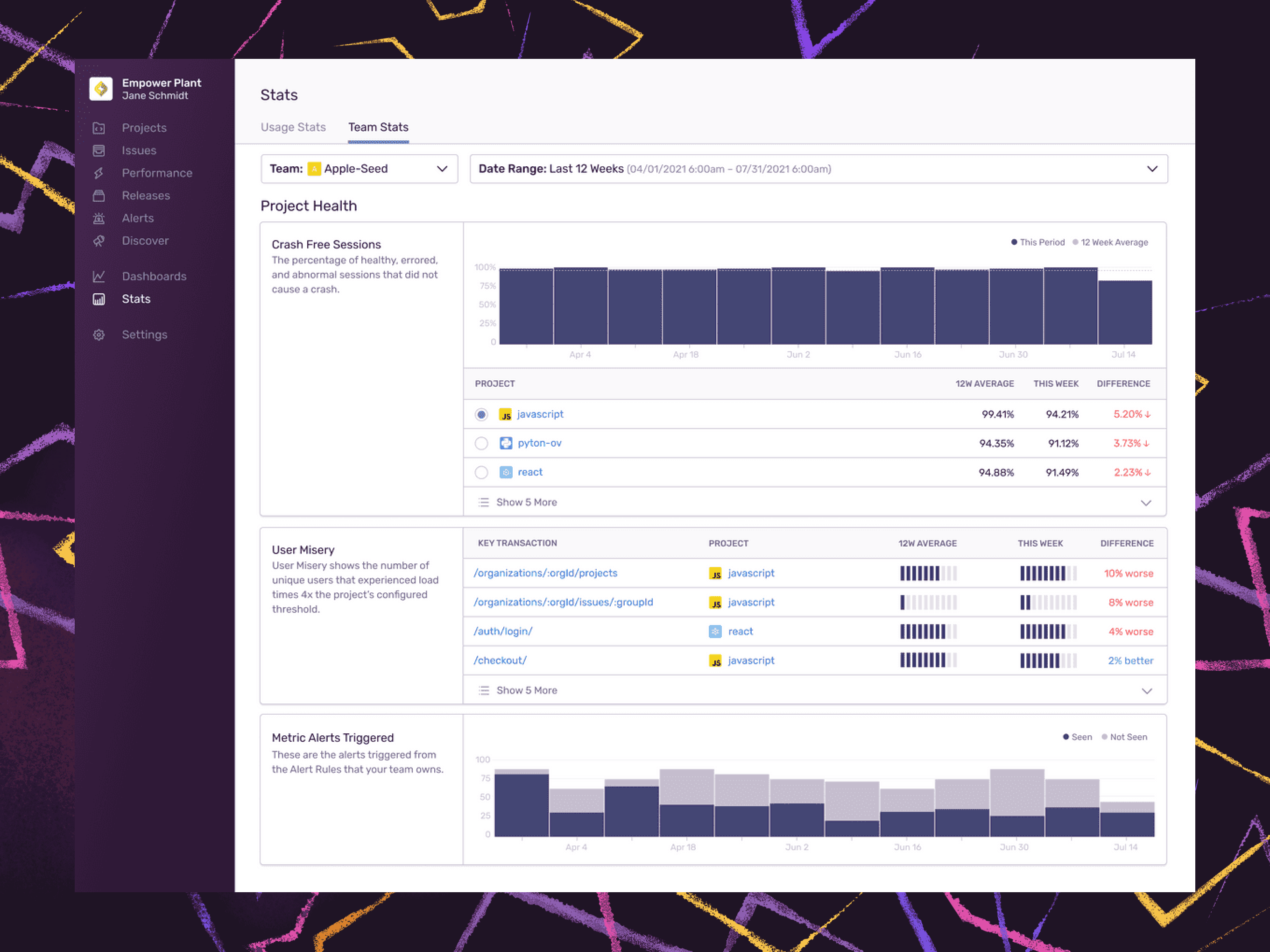
Measuring team effectiveness can be difficult. That’s why we’ve created a curated report of your project health and team activity, so you can better identify where to prioritize your team's time and track how effective they are in improving app stability.
Team Stats gives you a cross-project view into your application health while tracking how your team's projects affect users with stats such as crash-free sessions and User Misery. You can also see how your team takes action on issues with stats like issues reviewed by project, the overall time to resolution, and the number of releases over time.
As you track releases over time and in the event there’s a spike in users experiencing slow page loads, you can track how quickly your team resolves the issue compared to the previous week (or quarter).
These team-level stats let you zero in on the projects and transactions that might need attention from your team and see how they are improving over time. If you’ve been trying to secure additional resources or need help figuring out where to allocate your current resources, think of these as guiding metrics to track overall team velocity and efficiency.
Charts aren’t just for Ops
With custom dashboards, queries, and stats, you can get more visibility into your code health and drill into specific events to uncover opportunities, prioritize investments, and learn how to improve your team's release quality and velocity over time.
If you currently use Sentry and are a Business Plan customer, sign in to use these features today. New to Sentry and want to learn more? Request a demo or check out our latest webinar to see it all in action.

