Responsive Images: A cheap trick to improve page performance
Responsive Images: A cheap trick to improve page performance

Being a frontend developer, I’m always looking for ways to improve page load and render time performance issues. One of my biggest annoyances is when I’m waiting for that high quality, huge image of a product that shows up stunningly on the sharpest of computer screens…to load on my mobile devices. The site loads slower and is just a poor user experience, which often reduces conversion rate.
What I wish all developers would remember is:
Loading larger images in places they don’t need to be that large causes unnecessary page load and rendering slow downs.
Serving smaller images instead of the original large ones means that your users won’t be downloading a 3 MB image when they don’t need to. That means faster page load times, and better LCP scores.
Sentry can help you identify when images are causing the slow down, and this article will show you how to use Sentry to find the problem image, recommendations for fixing it, and how Sentry can continue to be your backup to avoid these slowdowns in the future.
How to use Sentry to identify problem images
The layout is not the only thing you can change when you’re developing your website for desktop and mobile devices. The browser allows you to change the content as well. That 1920x800 graphic looks very cool, but please don’t load the same image on mobile devices.
Clicking through the demo above, you can see a simple React site that is loading a 2.5 MB image with some text below the image. And even when opening the site on a mobile device, the whole 2.5 MB, even though it’s not even capable of displaying every single pixel of that image. The LCP score is way too high (almost a whole second) and is causing an unacceptable page load slow down.
The browser on the mobile device is scaling down that 1920x800 graphic to 828x345 anyways. So why ship a 2.5 MB image that causes a clear slowdown of your site, when you know it’ll be scaled down to the quality of a 500 KB one once the page is loaded?
Responsive images: a simple way to improve page load and render times
Responsive images aren’t just useful for when Sentry catches that culprit image that is causing the large LCP score and slowing down the page load time. You may just want to take advantage of those high DPR (device pixel ratio) screens, like Apple’s Retina display.
High DPR screens require providing images with resolution twice the size of the original. So, a 300x200 image would become 600x400 in order to keep it crisp on High DPR displays. Serving responsive images means that you’re serving different image sources based on the viewport size and the device pixel ratio.
You can leverage this to improve performance due to incorrect image size too. Let’s see how.
How to implement responsive images
There are two common responsive image techniques:
Resolution Switching: When you serve a smaller image for smaller screen resolutions
Art Direction: When you serve a different image for smaller screen resolutions, such as a zoomed in and cropped image.
How to implement resolution switching to improve LCP
The img tag by default only lets you add a single source:
<img src=”hungry-sentaur.jpg” alt=”A mural of the Hungry Sentaur” />But there’s one more attribute you can use to define responsive images: [srcset](https://developer.mozilla.org/en-US/docs/Web/HTML/Element/img#srcset).
If you just want to provide sources of smaller images, you can do something like this:
<img
  srcset=”hungry-sentaur-250w.jpg 250w, hungry-sentaur-600w.jpg 600w”
  src=”hungry-sentaur-600w.jpg”
  alt=”A mural of the Hungry Sentaur”
/>
Let’s break it down. srcset defines two images: a *-250w.jpg one and a *-600w.jpg one. After the source there’s also the image’s intrinsic width in pixels (the intrinsic size is the actual size of the image, not how big it is on the screen).
Note that it’s marked as 250w not 250px. So in short, with the srcset you register images that have different sizes and let the browser pick the most suitable one. You can check out this CodePen to see an interactive example [EMBED_CODEPEN].
Chrome will always download the 600px image, but if you open the example with Firefox and resize the window you’ll see it switch to the 250px one.
How to implement art direction to improve LCP
While the srcset allows you to load a lighter image for smaller screens, the [<picture>](https://developer.mozilla.org/en-US/docs/Web/HTML/Element/picture) element is more versatile and more suitable when you want to switch between images with different sizes and aspect ratios. Let’s say you have a wide banner at the top of the page which works well on desktop, but you want to crop it and turn it into portrait mode for mobile:
<picture>
  <source media="(min-width: 1280px)" srcset="hungry-sentaur.jpg">
  <source srcset="hungry-sentaur-portrait.jpg">
  <img src="hungry-sentaur-portrait.jpg" />
</picture>
This might look familiar to you. The video element also implements multiple source elements inside. In this case, the source elements define different image sources based on their media condition.
In this case, the first source sets the image source to hungry-sentaur.jpg when the viewport is at least 1280px wide. The second source doesn’t have a media attribute, so it’s a fallback source that sets the image source to hungry-sentaur-portrait.jpg. The third element is the <img /> and it’s there as a fallback for browsers that don’t yet support the <picture> element (IE and Opera Mini).
Here’s a CodePen for this example too: [EMBED_CODEPEN].
How to scale up images for high DPI devices
Sometimes you want to scale up, to provide crispier images to your visitors with fancy devices. In both cases (image with srcset and picture element), we have the option to define a higher-resolution image that the browser will render for high DPI devices, like MacBooks with Retina display and higher-end mobile devices.
Just like we defined two sources in the first example (250w and 600w) we can also define sources for 2x and 3x devices:
<picture>
  <source media="(min-width: 1280px)" srcset="hungry-sentaur.jpg, hungry-sentaur@2x.jpg 2x">
  <source srcset="hungry-sentaur-portrait.jpg, hungry-sentaur-portrait@2x 2x">
  <img src="hungry-sentaur-portrait.jpg, hungry-sentaur-portrait@2x.jpg 2x" />
</picture>

<img
  srcset=”hungry-sentaur.jpg, hungry-sentaur@2x.jpg 2x, hungry-sentaur@3x.jpg 3x”
  src=”hungry-sentaur.jpg”
  alt=”A mural of the Hungry Sentaur”
/>
Just by adding 2x and 3x after the image source, you’re registering those sources for 2x and 3x device pixel ratios. The browser is aware of them, and it will automatically use the most suitable one.
Using Sentry to verify the responsive image benefits
You’re now making smarter decisions about what image size you load on what devices, but did it work? Do you have a faster page load?
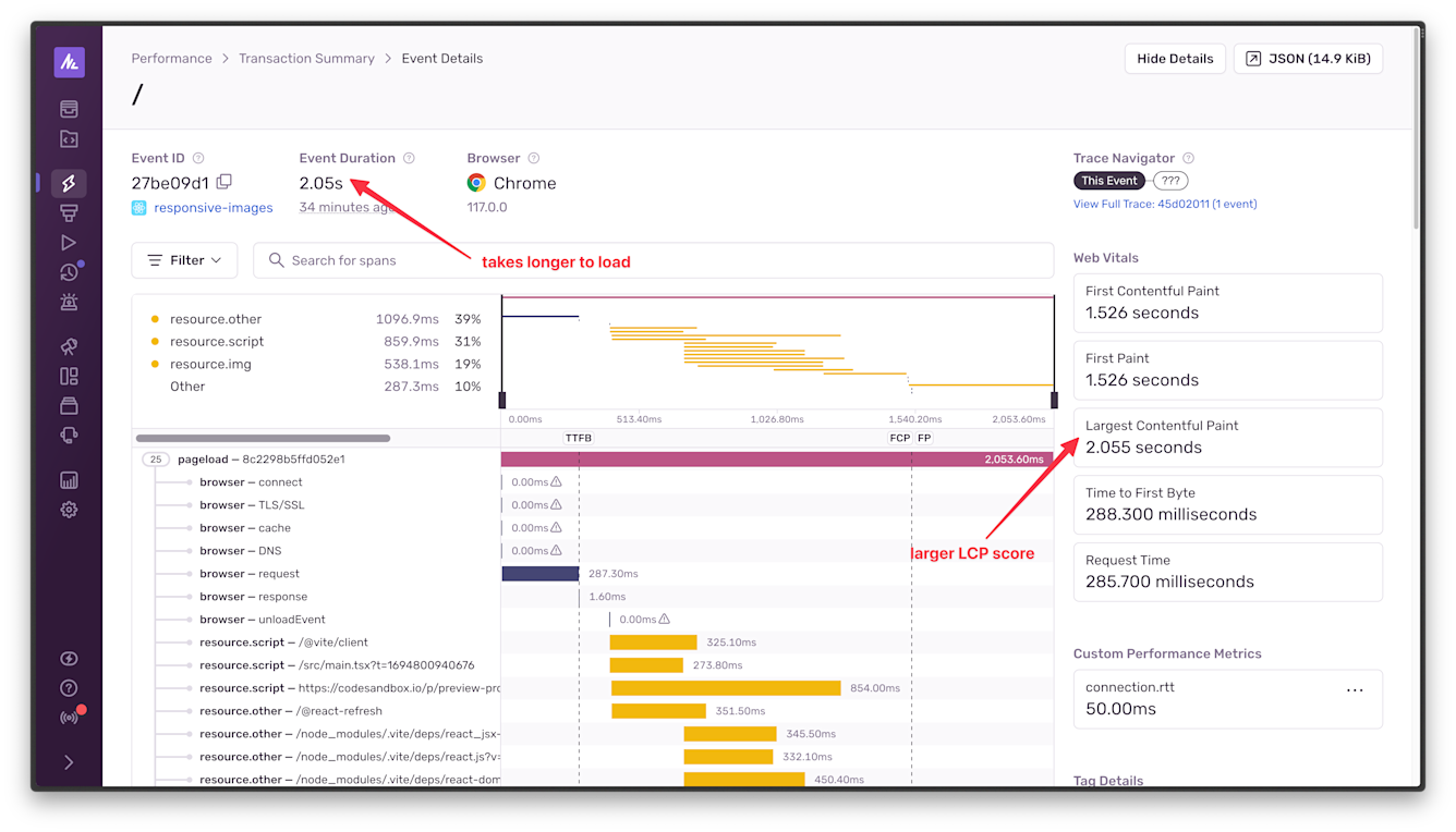
Remember, that 2.5 MB image loaded on the mobile site above caused an LCP of 2.055 seconds and an associated event duration of 2.05 seconds.
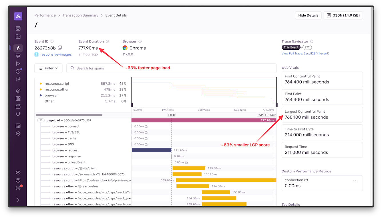
But when a smaller, 31 KB image is served instead, there is a 63% page load and LCP score improvement - since the LCP is the biggest cause of the page load time.
And there’s more!
Knowing best practices in content presentation also improves user experience. Being on a mobile phone and seeing a photo taken from a distance where the subject is a tiny dot at the center does not spark joy. Serving a cropped and zoomed version of that photo only for mobile browsers does.
And your business will be happier too. Improving user experience through improved page load and render time means users and customers are more likely to want to stay on your site. This reduces cart abandonment, opens up opportunities for users to share
Let Sentry help you measure and improve page load and render time
The data and screenshots in this post is all production data, albeit a very simple React site, this is not a localhost snapshot. It’s critical to keep an eye on your web performance continuously on your production deployment.
If you’re dealing with high quality images, there are a couple of ways to set up Sentry to help you find opportunities for responsive image optimizations.
Using Sentry's LCP Alerts
The easiest way to keep up to date on other images causing page load and render time slowdowns is to setup LCP Alerts. These more advanced alerts do require at least a Sentry Team plan, you can compare Sentry plans here.
To get started with LCP Alerts:
Open the Alerts page and create a new Alert.
Choose Largest Contentful Paint under the Performance Alert options and click Set Conditions.
For the example in this post, here are some suggested conditions:
Set your LCP metric to p95
Filter the events to the project and environment
Add a second filter for
lcp.element:[%img]to only trigger the alert for images that are causing LCP issues.Referring to the historical LCP values charted at the top of the page, choose the Critical, Warning, and Resolved thresholds. For example, you m ight set the Critical threshold to a 50% change, the Warning threshold to a 30% change and leave the Resolved threshold automatic.
Choose the alert action (e.g. send an email for the Warning threshold being violated and send an email and ping in Slack when the Critical threshold is violated).
Name the alert, for example
image-caused LCP Alert
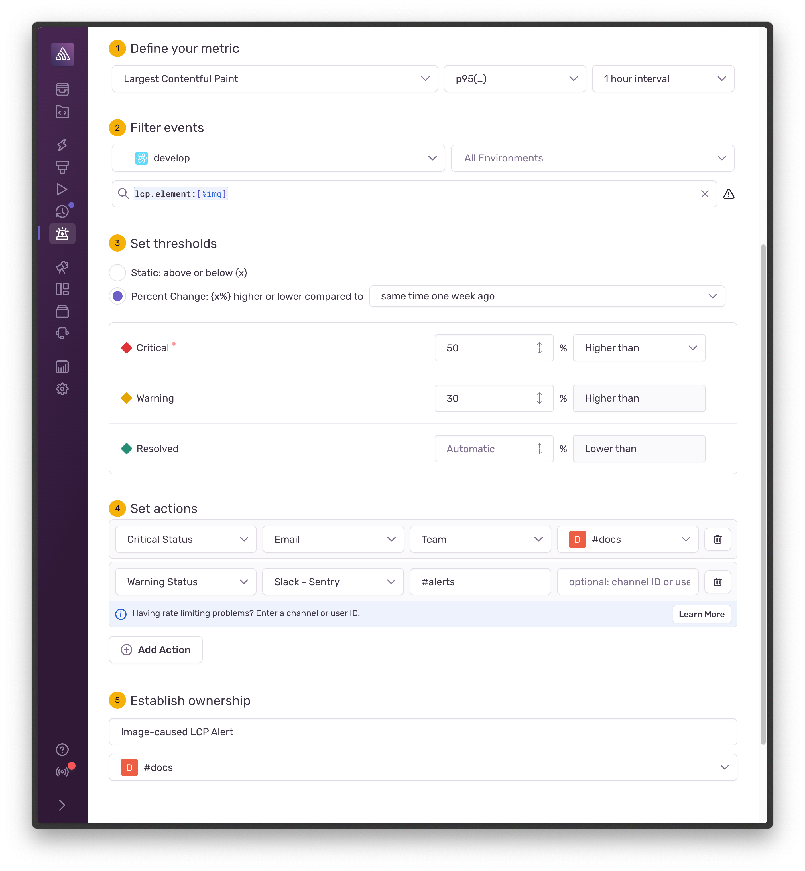
Click Save Rule
Grab your sunglasses and phone - because you no longer have to monitor large images and can rest assured that Sentry will let you know if another images causes any LCP and page load performance issues.
Stay Tuned for More Tips on Improving Page Load and Render Time
Now that you don’t have to worry about those pesky large images ruining your LCP score and causing your customers to abandon their carts because that high quality product image is taking too long on their phone (😮💨)…it’s time to get even more performance gains on the front end.
Stay tuned for more tips, tricks, how-tos, and deep dives into other ways Sentry can help you discover, improve, and continue to monitor page load and render time performance issues.
Next, we’re going to revisit lazy loading for images and dive into how an overly complex DOM affects your page performance.


