Sentry has a bold new look
Sentry has a bold new look


As you may have noticed, Sentry just got a major glow-up.
For too long our product looked like boring enterprise software, while our brand screamed bold and irreverent. No more. From this moment forward our product now matches the vibe you’ve come to expect from us. The result is something that’s more vibrant, more tactile, and more Sentry.
Welcome to the S.C.R.A.P.S. era – our new design language (that’s Standardized Collection of Reusable Assets & Patterns for Sentry, of course). It injects all of Sentry’s weird charm straight into the app.
How this all started
Sentry’s product has grown a ton over the years, but visually it mostly evolved in small, incremental steps. “Don’t fix what isn’t broken” only works for so long; design ages quietly, and what once felt fresh starts to feel stale the moment expectations shift.
Meanwhile, our brand was racing ahead. The illustrations got weirder (in a good way), our tone got bolder, and the product… stayed understated. The two slowly drifted apart. Apps are always quieter echoes of their brands, but in our case, the gap had become hard to ignore. The product just didn’t feel like Sentry anymore.
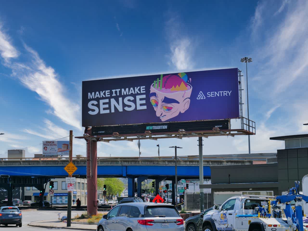
Our most recent marketing campaign, “Make it make sense.”
Sentry’s early success came from doing things a little differently – sweating the craft when others didn’t, and refusing to sound like anyone else. Our first tagline, “Sh*t Happens. Be on top of it.”, set the tone: honest, human, and not afraid to have a sense of humor about the chaos of software.
That voice still defines us, but the landscape has changed. These days, polish is the baseline. Every app looks good. So when we decided to redesign Sentry, we weren’t chasing a sleeker UI – we were chasing something that felt like us again.
The challenge? Finding the right balance between personality and practicality. That tension – between the art and the system – is where S.C.R.A.P.S. was born.
What we arrived at
Where things once felt flat and restrained, the interface now has more depth and character. It’s tactile without being flashy, drawing cues from our illustration style to give the product a stronger sense of presence. Not skeuomorphic, not minimal – something fun and interesting in between.
We weren’t chasing realism. Instead of mimicking the physical world, we asked a different question: What would this look like if it existed inside a Sentry illustration? The result is an interface that feels more alive but still gets out of your way when you’re working.
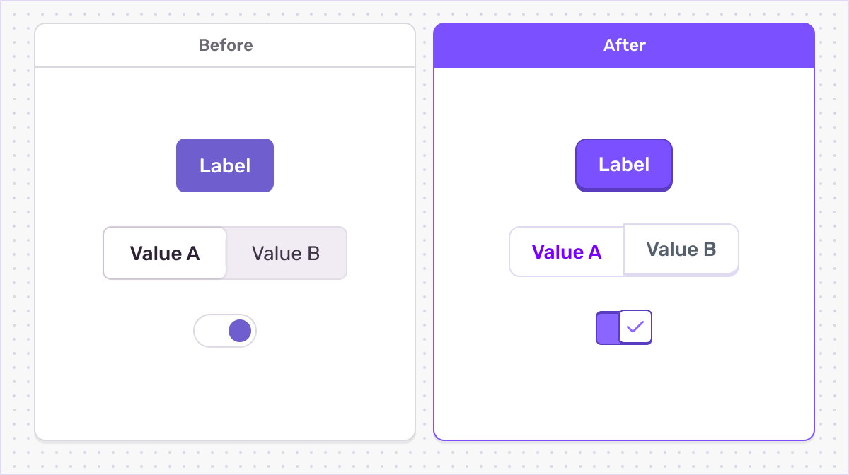
In many ways, Flat UI, as a design trend, focused on uniformity – an exercise in reducing something into its simplest form. We still retain a lot of those same practices but add a little extra ornamentation to better communicate what each element expects in terms of user input.
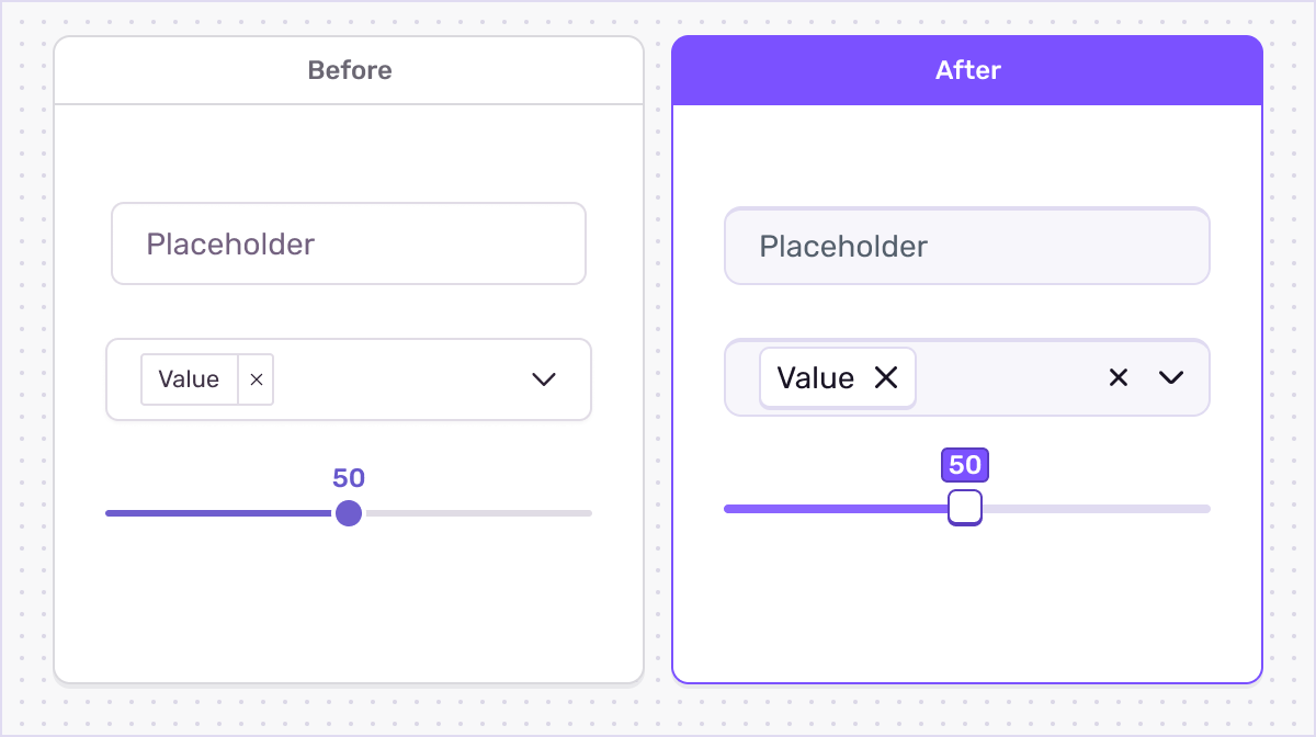
Since certain form elements require text input, we felt it more natural that they visually sink into the page rather than protrude. This resulted in a clear pattern where different elements have different styles based on what input they expect from the user.
That push toward physicality led to another question: if it looks more physical, should it also feel physical? Traditional UI borrows from real-world objects – buttons, sliders, switches – but software doesn’t have to play by the rules of reality. We get to choose which parts of reality to keep and which ones to reinvent.

S.C.R.A.P.S. switches convey the state they are in through their tactile style.
Making the UI look more physical raised an interesting question: should it also feel more physical? Interface patterns are typically modeled after real-world objects (buttons, sliders, switches, etc.), but unlike the physical world, they’re not limited by materials or mechanics. Digital space gives the freedom to decide which aspects of reality to keep and which to reinvent.
Take our buttons. They lift ever so slightly when hovered to greet your cursor. Real buttons don’t do that, but it tells you that they’re ready to be clicked. Inputs now subtly sink into the page instead of sitting on top of it, reinforcing the sense of interaction. Tiny details, sure, but together they make Sentry feel more human and more responsive.

S.C.R.A.P.S. buttons stand taller than other elements and when pressed, recess to the surface of the page.
Each new interaction we design asks the same question: Should it behave like something familiar from the physical world, or something unique to the digital one? The answer will change over time, but that’s what makes this language so exciting. S.C.R.A.P.S. isn’t about choosing one world over the other; it’s about learning from both.
Overall, this new design language is pretty huge. We departed from industry conventions to find a look that feels exactly like Sentry in 2025, giving us an exciting new baseline to iterate from.
How we pulled it off
This redesign was a huge effort. It took a year and a half of collaboration across design, design engineering (a team that was spun up by our chief creative officer specifically to make this happen), front-end, and brand – rebuilding hundreds of components to feel sharper, more consistent, and easier to maintain. Under the hood, nearly every corner of the product got touched, tuned, or rethought.
The result is more than a visual refresh. It’s a new foundation – one that lets us build faster, ship with more consistency, and keep more of Sentry’s personality intact along the way. S.C.R.A.P.S. isn’t just how Sentry looks, it’s how we work now.
Why we went in this direction
Our brand is extremely visual and expressive. The illustrations, which are core to our brand, tell dynamic stories about teams building something together.
Over the past few years the illustrations have become more solid and three-dimensional, using fictional metaphors (construction, space exploration) that are assembled using objects recognizable from the real world. We saw an opportunity to bring that same sense of depth and presence into the product itself. S.C.R.A.P.S. takes inspiration from these illustrations by making our design system feel more tangible and “real” too.
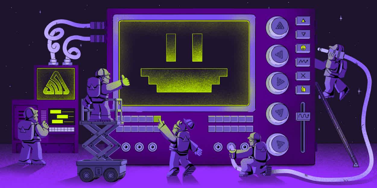
A recent blog post illustration, highlighting how you can use Sentry to monitor your AI features.
Another big part of our brand is our voice. When we say “code breaks” or “make it make sense,” we’re not pretending everything’s fine. We’re acknowledging the mess — with a wink. It’s direct, human, and self-aware. That same honesty shaped S.C.R.A.P.S. too, giving the interface a tone that feels confident without taking itself too seriously.
Final thoughts
S.C.R.A.P.S. isn’t just a new look – it's a total cultural reset. For years, we’ve shipped fast and often, but not always at the same standard. This project gave us the chance to slow down, build better systems, and create a more connective tissue between design and engineering.
It started with tokens in Figma and components in code, but it led to much more: a new design engineering team, a rebuilt design system, proper design documentation, and a tighter, more collaborative design culture.
If you look at these changes alongside the new navigation, it becomes clear we're tackling two major challenges – complexity and consistency. The navigation helps explain why you might move through multiple Sentry products to fix a nasty bug, while S.C.R.A.P.S. keeps those experiences predictable – in a way that still feels distinctly Sentry. Together, these efforts aren’t just about fixing what was broken – they're about setting the stage for what Sentry becomes next.
So consider this our reintroduction. The Sentry you see today is sharper, more expressive, and built to evolve. We’re proud of where we’ve landed – and even more excited about what comes next.