Sentry has a new look
Sentry has a new look


I’m excited to share that, as of today, Sentry has a new look, kicking off “Scraps,” the next generation of our design system. Scraps represents a Standardized Collection of Reusable Assets and Patterns for Sentry. Silly acronyms aside, these changes bring our product closer to the brand and represent a major investment in improving the overall health of our application.
How this all started
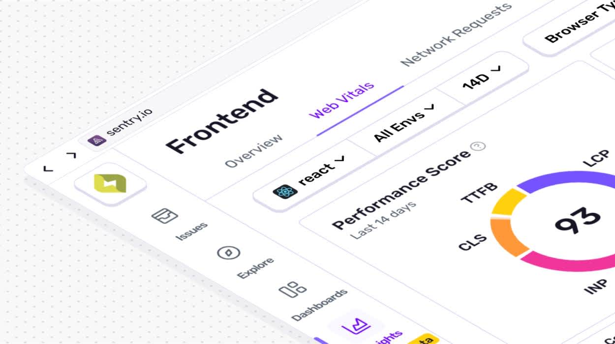
After hearing user feedback around Sentry’s design feeling stale and inconsistent, we knew we had to change things up. You see, while Sentry has expanded significantly over the last few years, we weren’t investing enough in the core tech that would keep our platform feeling cohesive. For example, newer products such as Session Replay and Profiling are very dense, interactive experiences. As we built them, it became clear that our design system wasn’t flexible enough to support those kinds of products. Of course, hindsight is 20/20.
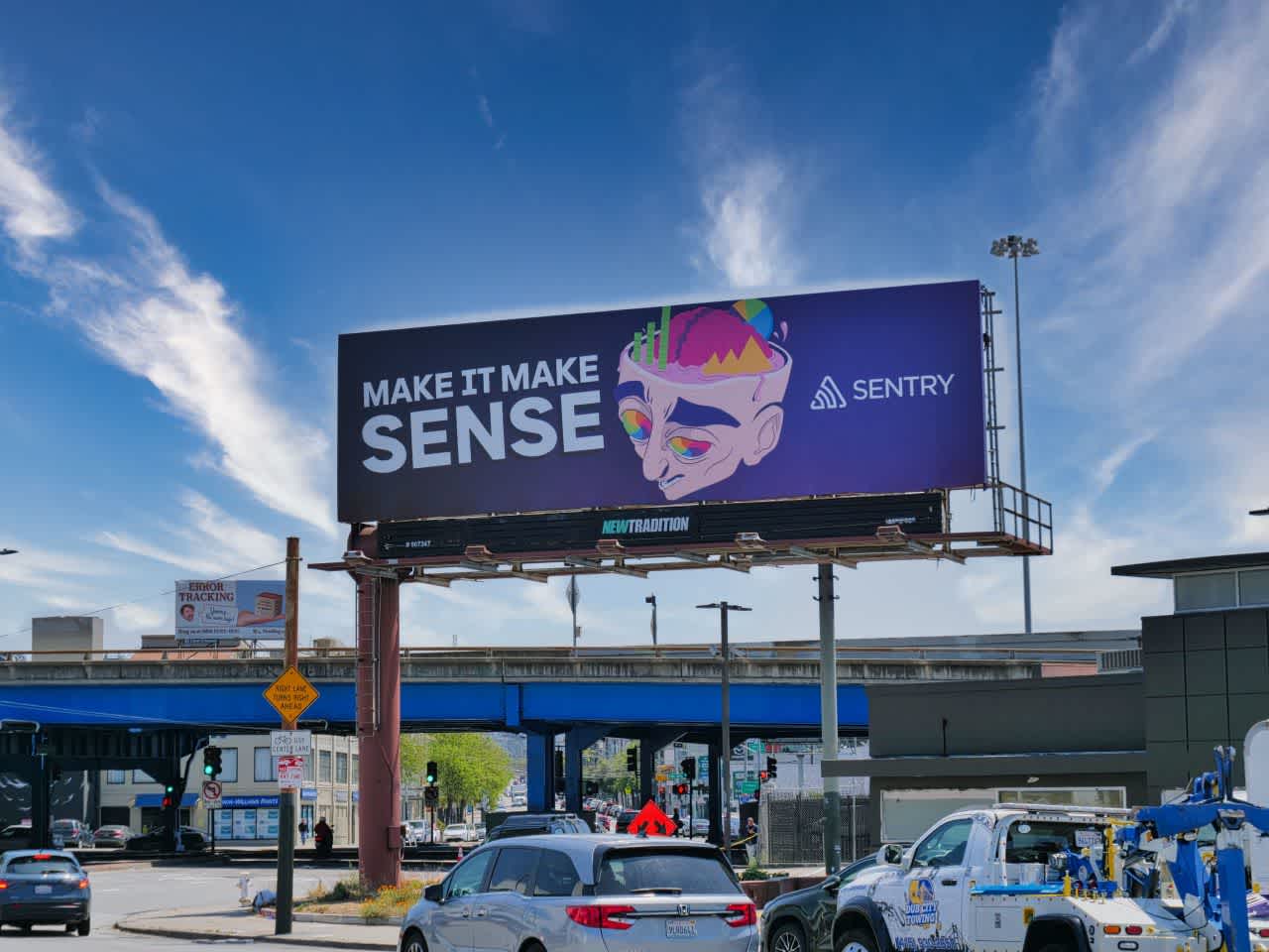
Our most recent marketing campaign, “Make it make sense.”
Our brand identity was evolving as well: illustrations became more eccentric (in a good way), verging on psychedelic, our tone of voice more emotional. These changes made us realize that our product and its visual design language was from another era. Apps are usually quieter reflections of a company’s brand, but for Sentry, the gap had become uncomfortably wide.
How do you make our design system more flexible while having more personality? That's what the product design team discussed during summer 2024 when we officially kicked off our refresh of Sentry’s visual design language.
What we arrived at
Flashforward to fall 2025. I’m thrilled to share our new design language for Sentry. Where it was once muted and flat, it’s now more tactile and vibrant. These changes make digital elements feel more physical, drawing from our illustration style to create a sense of depth and presence. While this might sound like the skeuomorphic old days of faux-leather and glossy buttons, we approached it differently. It was less about imitating how objects look in the real world and more on how they’d look in our illustrations. We’re betting our users will appreciate an app that feels more like us as long as it doesn’t get in the way.

Scrap switches convey the state they are in through their tactile style.
Making the UI look more physical raised an interesting question: should it also feel more physical? Interface patterns are typically modeled after real-world objects (buttons, sliders, switches, etc.), but unlike the physical world, they’re not limited by materials or mechanics. Digital space gives the freedom to decide which aspects of reality to keep and which to reinvent.
Our buttons, for example, lift to greet your cursor when hovered. Real-world buttons don’t do that, of course, but this behavior reinforces the idea that it wants to be clicked. Form inputs are another space where we broke away from physical metaphors. Form elements in print are static boxes showing where text should go; in the digital world, they can react and communicate. It’s that responsiveness found in digital space that’s inspired us to deviate.

Scrap buttons stand taller than other elements and when pressed, recess to the surface of the page.
Each new interaction we design asks the same question: Should it behave like something familiar from the physical world,–or something unique to the digital one? The answer will change over time, but that’s what makes this language so exciting. Scraps isn’t about choosing one world over the other; it’s about learning from both.
Why we went in this direction
To understand why we went the way we did, it helps to step back and look at Sentry as a brand. The biggest names in tech have built identities so polished and pristine they almost feel untouchable. They project control and perfection like nothing ever goes wrong. But Sentry’s not that. We’d rather be approachable, a little imperfect, and grounded in reality. Things break–and that’s okay. What matters is that we’re here to help you make sense of it.
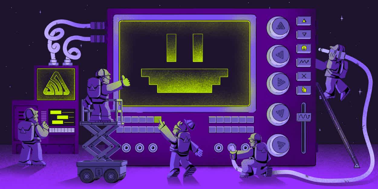
A recent blog post illustration, highlighting how you can use Sentry to monitor your AI features.
Our brand is extremely visual and expressive. The illustrations, which are core to our brand, tell dynamic stories about people (you and your team) building something together. Over the past few years the illustrations have become more solid and three-dimensional, using fictional metaphors (construction, space exploration) that are assembled using objects recognizable from the real world. We saw an opportunity to bring that same sense of depth and presence into the product itself. Scraps takes inspiration from these illustrations by making our design system feel more tangible and “real,” too.
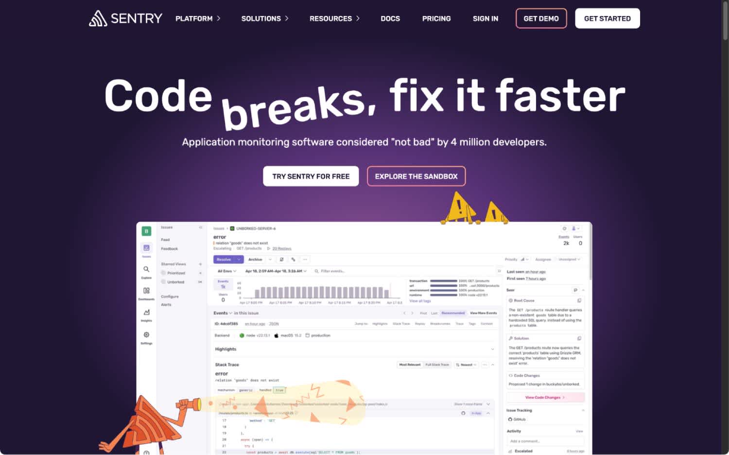
A screenshot from our marketing website.
Another big part of our brand is how we talk. When we say “code breaks” or “make it make sense,” we’re not pretending everything’s fine. We’re acknowledging the mess–with a wink. Our voice is direct, human, and self-aware. That same honesty shaped Scraps too, giving the interface a tone that feels confident without taking itself too seriously.
Final thoughts
Beyond our new look, Scraps has also presented us with a new opportunity. At Sentry, historically, we’ve had a cultural challenge around a team that built a lot but didn't maintain or adhere to strict systems. This is an opportunity to change that culture and create systems that are both collaborative (designers and engineers contributing) and easy to use. While this project has allowed us to create these initial tokens in Figma and in code, it has also led to so much more: the creation of our design engineering team, a relaunch of our storybook design system, and a more-engaged design culture.
So, consider this our (re)introduction to the world. We're proud of what we've done, but we expect to do so much more, and we hope people keep coming back to enjoy using Sentry with us.